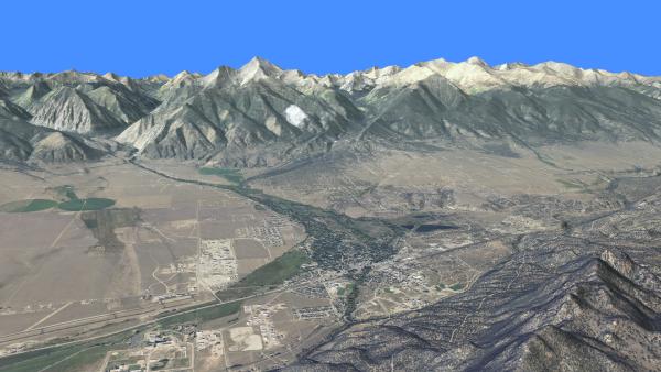
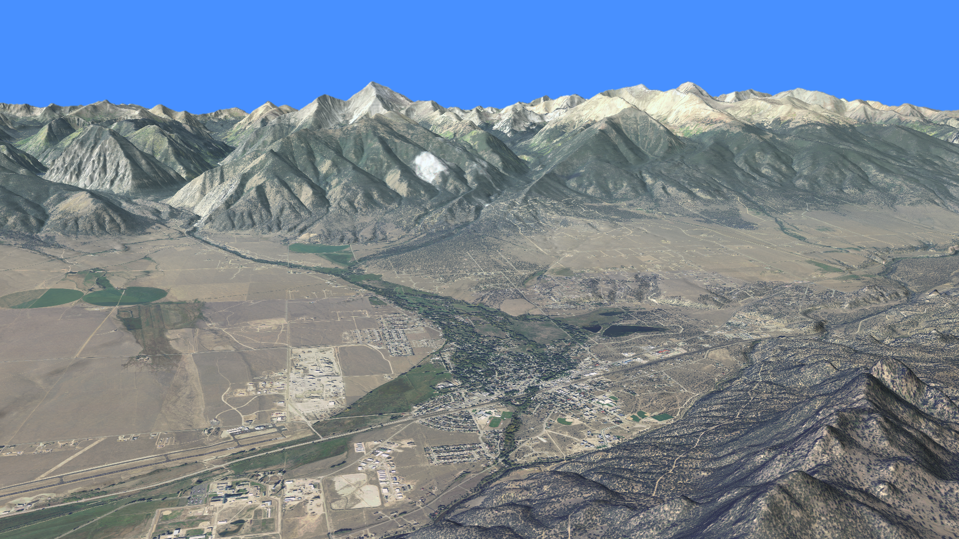
In September 2013 - one year ago this month - my hometown of Lyons, Colorado, endured epic flooding. September is usually a dry and stable weather month in Colorado, but extraordinary meteorological conditions set up to produce what the National Weather Service described as "biblical rainfall" in the mountainous area west of Lyons. The stalled storm and steep topography provided a particularly violent combination, producing widespread property damage and taking a number of lives along Colorado's Front Range.
To understand the factors that contributed to this event, we've created a kickstarter.com project to produce a video that will illustrate the unusual conditions that generated the flooding. Here's our kickstarter video:
...and here's the direct link to the kickstarter page:
https://www.kickstarter.com/projects/1727437487/simulation-of-a-disaster-lyons-co-epic-flooding-of
Please consider contributing to this very worthy project!
Monday, September 8. 2014
Lyons Flood Kickstarter Project
Tuesday, April 23. 2013
Another Terrain Morph
Monday, April 22. 2013
Slumgullion Slide and Lake San Cristobal
I've previously posted on the beautiful Alpine Loop Back Country Byway. Traveling southwest out of Lake City, you pass picturesque Lake San Cristobal - Colorado's 2nd largest natural lake. Here's an edWare3D rendering looking NNW along the Lake Fork of the Gunnison River showing the lake.
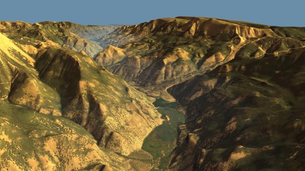
(Click for high res version.)
It also wonderfully illustrates the reason the lake's there - the Slumgullion Slide dammed the river. Here's a great resource for those interested in learning more about the slide. The landslide episode that created the dam occurred about 700 years ago.
A section of the slide is still active. Here's another rendering showing the active portion in red, with the inactive portions in blue.
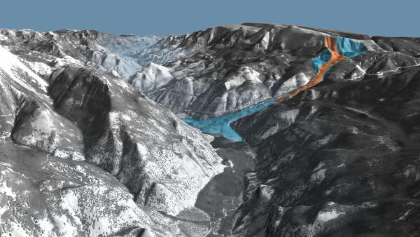
(Click for high res version.)
And here's an animation showing patented mining claims in the Alpine Loop area:

(Click for high res version.)
It also wonderfully illustrates the reason the lake's there - the Slumgullion Slide dammed the river. Here's a great resource for those interested in learning more about the slide. The landslide episode that created the dam occurred about 700 years ago.
A section of the slide is still active. Here's another rendering showing the active portion in red, with the inactive portions in blue.

(Click for high res version.)
And here's an animation showing patented mining claims in the Alpine Loop area:
Wednesday, February 20. 2013
Sangre de Cristo Range
The picturesque Sangre de Cristo range of southern Colorado / northern New Mexico is a magnet for outdoor enthusiasts of all types. I've personally been hiking, fishing, rock climbing and mountaineering in the range. It contains 8 of Colorado's coveted 14ers - that is, summits exceeding 14,000 feet in height. (Some consider Ellingwood Peak to be a subsidiary summit of Blanca Peak, leaving 7 14ers instead.) The northern - or Crestone - section of the range contains four 14ers: Crestone Needle, Crestone Peak, Kit Carson Peak and Humboldt Peak. Here's an edWare3D rendering of this portion of the range, viewed from the west over a cloudy San Luis Valley:

(Click for high res version.)
To the south lies the Blanca Massif containing Blanca Peak, Ellingwood Peak, Mt Lindsey and Little Bear Peak. Here's a nice south-to-north fly-over of the range. After topping the Blanca Massif, look for Great Sand Dunes National Park to the west (left.)
Happy travels!
(Click for high res version.)
To the south lies the Blanca Massif containing Blanca Peak, Ellingwood Peak, Mt Lindsey and Little Bear Peak. Here's a nice south-to-north fly-over of the range. After topping the Blanca Massif, look for Great Sand Dunes National Park to the west (left.)
Happy travels!
Thursday, February 7. 2013
Superimposed Rivers
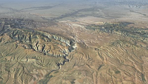
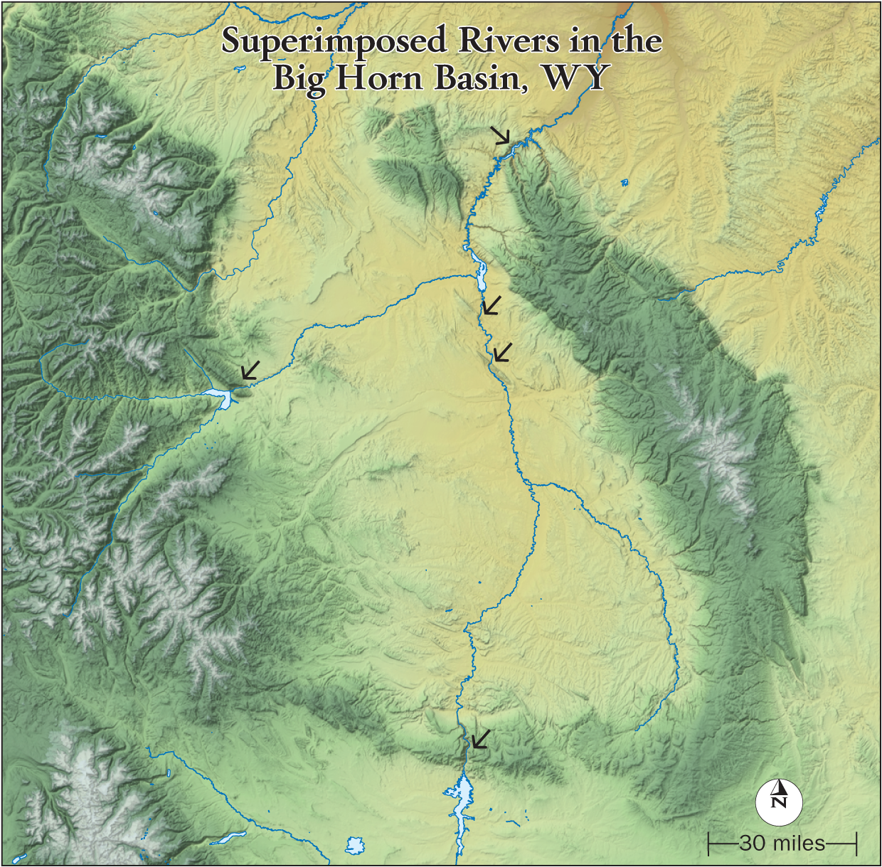
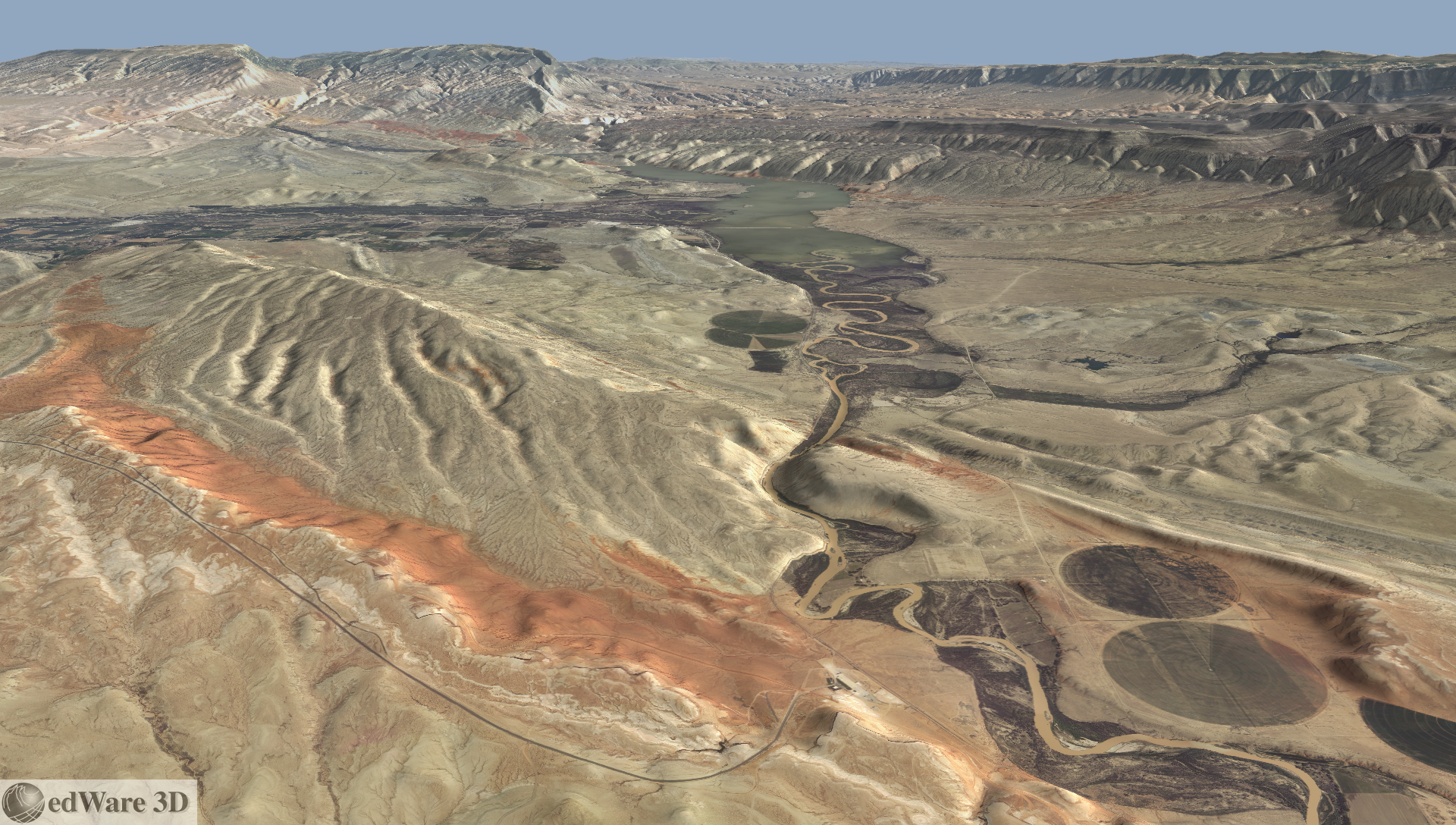
The Big Horn Basin must be the superimposed river capital of the world. Superimposed rivers are named such because they're superimposed over complex topography, often with bewildering results. The river establishes a course, then regional uplift uncovers geological obstacles. The river down-cuts through strata along its path producing head-scratching topographic features.
This map (thanks Heidi!) shows the setting in north-central Wyoming. Arrows mark locations where river superimposition occurs; edWare3D images of these locales are shown below.
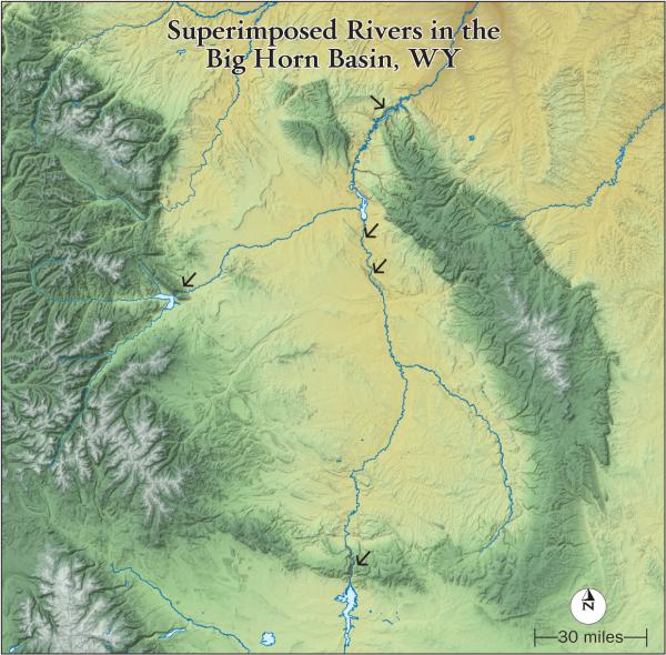
(Click for high res version)
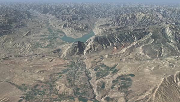
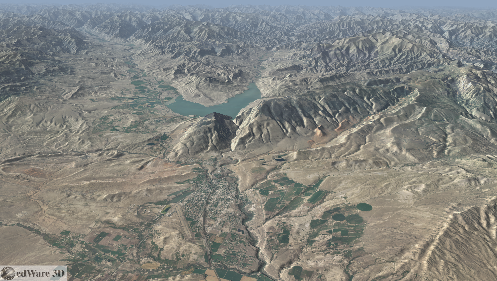
From Boysen Reservoir, the Wind River cuts through the Owl Creek Mountains forming the Wind River Canyon on its way into the Big Horn Basin. So downstream is into the mountains from the Wind River Basin. I've always been disoriented driving through this Canyon. The water looks like it's flowing uphill!
(Click for high res version)
This animation circles Boysen Reservoir. Remember that downstream is into the mountains.
The Wind River becomes the Big Horn River in the Big Horn Basin.
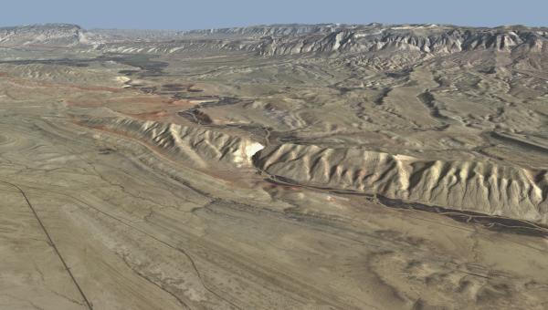
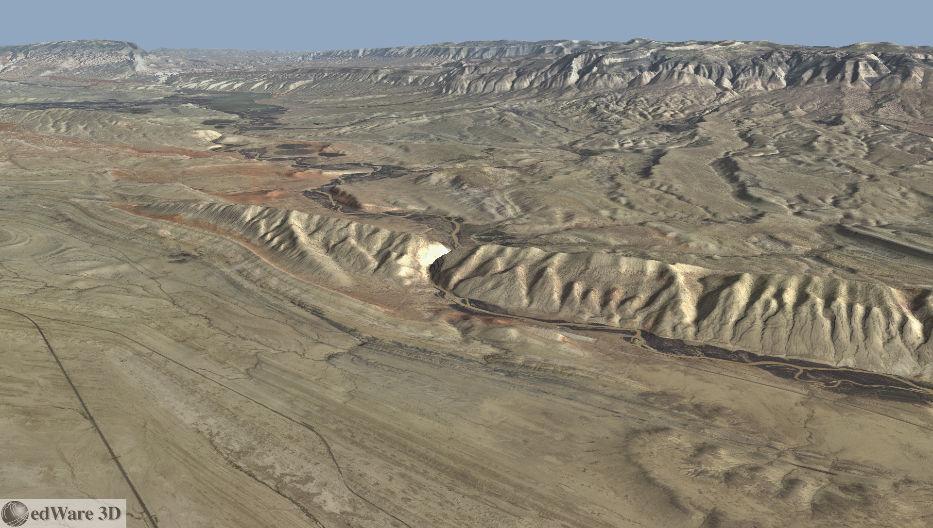
On the west side of the Big Horn Basin, the Shoshone River exits Buffalo Bill Reservoir and cuts the Shoshone River Canyon near Cody, WY. It's incredible that the river doesn't flow slightly south (left in the image) through gentle terrain.
(Click for high res version)
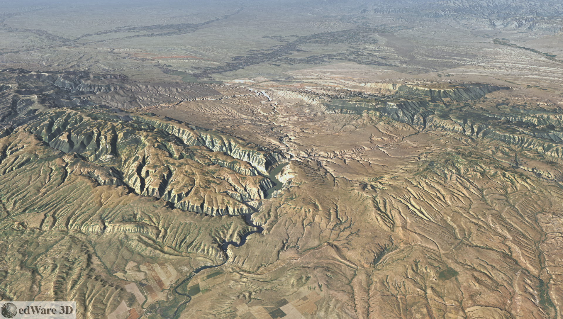
Back along the Big Horn River, here are views of cuts through Sheep Mountain and Little Sheep Mountain. Both these landforms are anticlines - upfolded structures with oldest strata at their cores.
Sheep Mountain (Click for high res version)
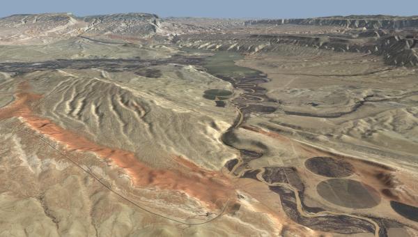
Little Sheep Mountain (Click for high res version)
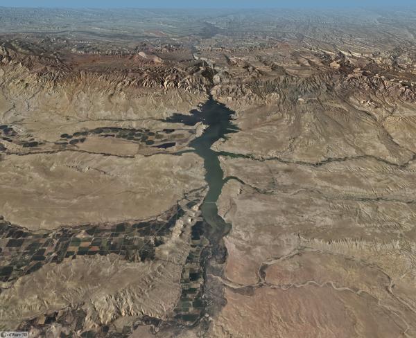
It's only appropriate that the Big Horn River be superimposed where it exits the Basin as well - and it's a spectacular example. Here's Big Horn Lake in Big Horn Canyon along the Big Horn River through the Big Horn Mountains leaving Big Horn Basin. I think I see a naming trend here!
(Click for high res version)
For anyone who's interested in the world's geological wonders, this area is well worth a visit.
This map (thanks Heidi!) shows the setting in north-central Wyoming. Arrows mark locations where river superimposition occurs; edWare3D images of these locales are shown below.
(Click for high res version)
From Boysen Reservoir, the Wind River cuts through the Owl Creek Mountains forming the Wind River Canyon on its way into the Big Horn Basin. So downstream is into the mountains from the Wind River Basin. I've always been disoriented driving through this Canyon. The water looks like it's flowing uphill!

(Click for high res version)
This animation circles Boysen Reservoir. Remember that downstream is into the mountains.
The Wind River becomes the Big Horn River in the Big Horn Basin.
On the west side of the Big Horn Basin, the Shoshone River exits Buffalo Bill Reservoir and cuts the Shoshone River Canyon near Cody, WY. It's incredible that the river doesn't flow slightly south (left in the image) through gentle terrain.
(Click for high res version)
Back along the Big Horn River, here are views of cuts through Sheep Mountain and Little Sheep Mountain. Both these landforms are anticlines - upfolded structures with oldest strata at their cores.
Sheep Mountain (Click for high res version)
Little Sheep Mountain (Click for high res version)
It's only appropriate that the Big Horn River be superimposed where it exits the Basin as well - and it's a spectacular example. Here's Big Horn Lake in Big Horn Canyon along the Big Horn River through the Big Horn Mountains leaving Big Horn Basin. I think I see a naming trend here!
(Click for high res version)
For anyone who's interested in the world's geological wonders, this area is well worth a visit.
Thursday, December 6. 2012
Atmospheric Visualization - Katrina Example
In my last post, I looked at some unusual options for visualizing subsurface phenomena. The subsurface bodies in that example, which might represent pollutant plumes or ore bodies, were generated as isosurfaces from fractal volumes.
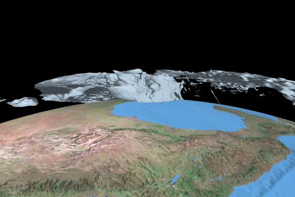
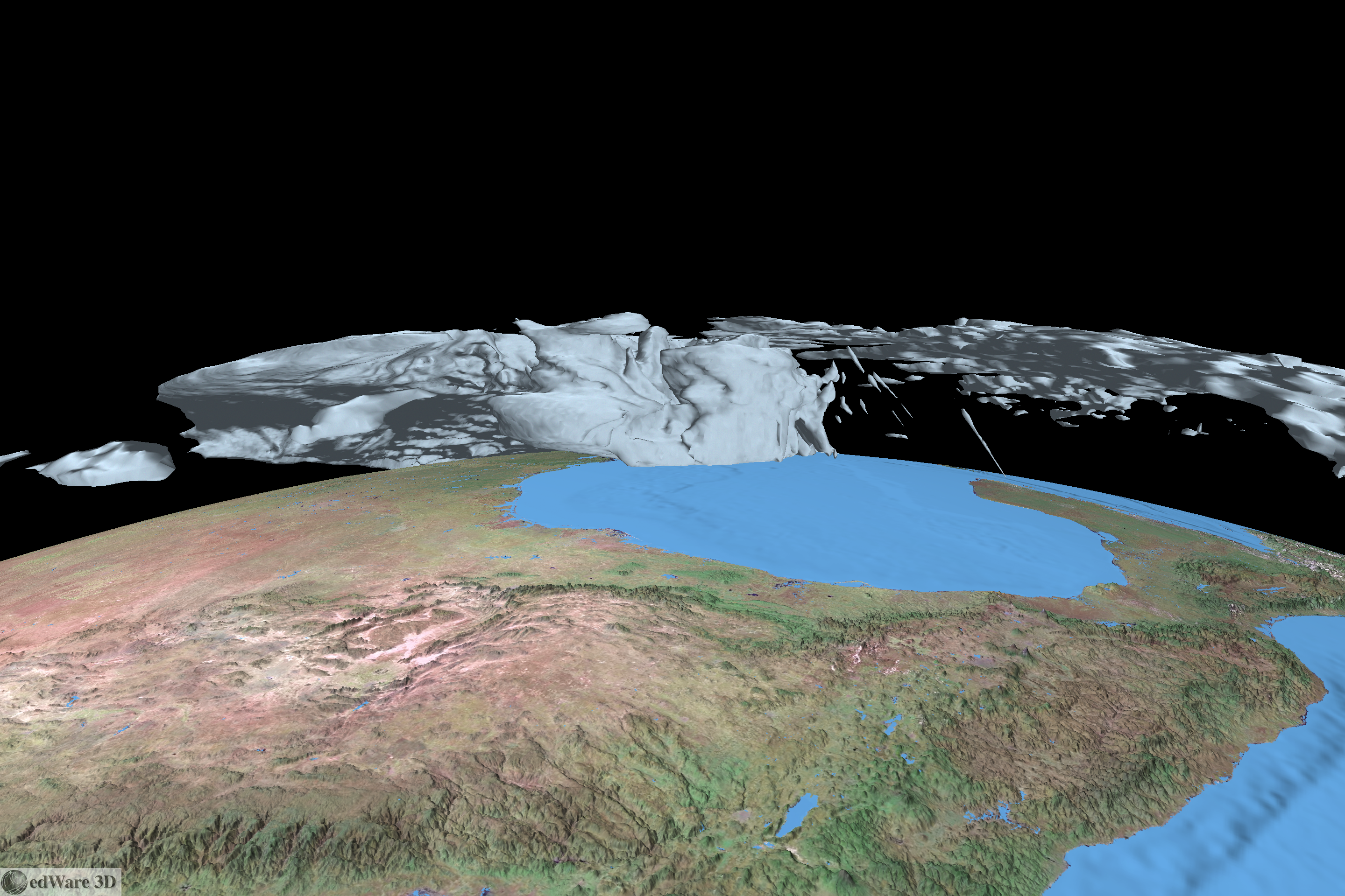
Another volume modeling visualization area of application is analyzing atmospheric data. A few years back we animated some model data representing the devastating Hurricane Katrina. Here's a frame from that animation that I've regenerated at higher resolution:
(Click image for high resolution version.)
Model data is courtesy of Jian-Wen Bao of the National Oceanic and Atmospheric Administration (NOAA). The gray atmospheric "body" shows the 25 m/s isosurface generated from model output for a time slice on Aug 29, 2005. The core of the high wind area engulfs New Orleans, LA, with the well-known tragic results. You can view a small-sized version of the animation in the "Volume Modeling" section of our animations page.
Monday, December 3. 2012
Subsurface Visualization
I've been thinking about various methods for visualizing subsurface phenomena - things like ore bodies, pollutant plumes, etc - within the context of overlying surface features. The first thing that came to mind was to make the surface landscape transparent and have the subsurface volumes show through. I haven't been able to get this to work in a way that I can understand what's going. Look at this image for instance:
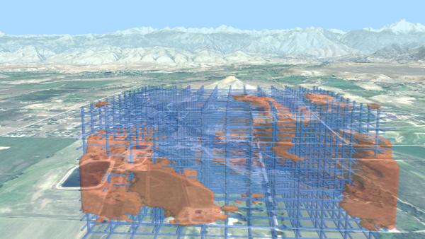
(Click for high res version)
I've added a grid to try to help orient, but it just doesn't work for me. The lake in the lower left looks like it's below the level of the subsurface features (the subsurface features are actually set back quite a ways.) Obviously I would need to work a lot on depth cues to make this usable.
I've come up with two other ideas that I haven't seen used. One is the "porthole to the beyond" effect (poke a hole in the z-buffer and fly on in); another is the "sinkhole" or "melting mountains" effect. Here's an animation that shows them both. It begins with the "porthole" effect, flying into a polygonal hole in the landscape. After breaking back through the surface, it flies to an overview showing the "sinkhole" mode.
It's still pretty disorienting, but I really like the effects!
Wednesday, October 24. 2012
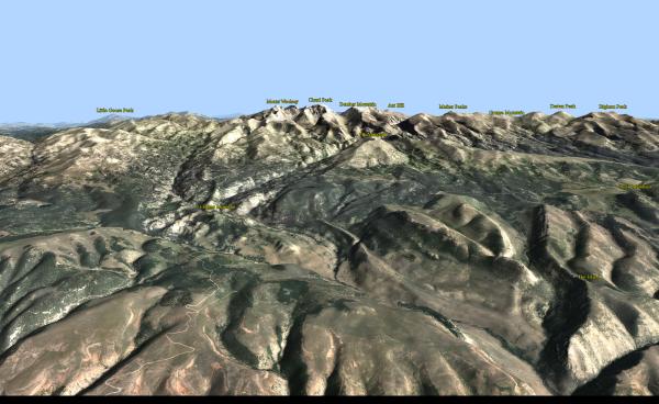
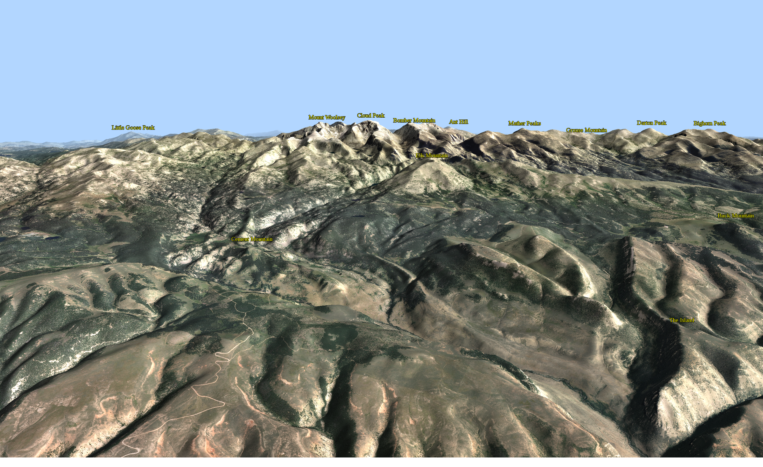
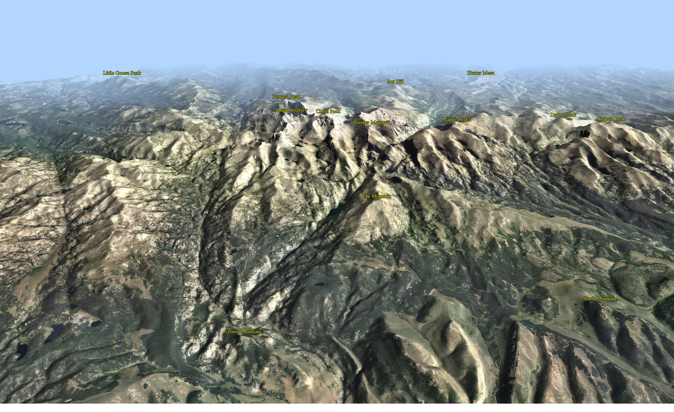
Big Horn Mountains
Many years ago, when I was in grad school in geology, my thesis field area was in the Big Horn Basin of north-central Wyoming. Looming over the Basin to the east were the majestic Big Horn Mountains. Cloud Peak is the monarch of the range and appears in the center of the image below:
(Click for high res version)
You'll need to click through to read the text. Summits are labeled with coordinates from the USGS GNIS database, briefly described in this post.
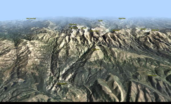
This higher perspective helps to separate the peaks and gives a good feel for the rugged topography in the range:
(Click for high res version)
Low sun from the south helps to highlight the E-W trending ridgelines in the foreground. Clear air keeps things crisp up to the summit crest; attenuation gracefully subdues the background.
(Click for high res version)
You'll need to click through to read the text. Summits are labeled with coordinates from the USGS GNIS database, briefly described in this post.
This higher perspective helps to separate the peaks and gives a good feel for the rugged topography in the range:
(Click for high res version)
Low sun from the south helps to highlight the E-W trending ridgelines in the foreground. Clear air keeps things crisp up to the summit crest; attenuation gracefully subdues the background.
Friday, October 19. 2012
Our Versatile Friend, the Sphere
I've been playing around with a web-based tool for adding 3D primitives for rendering in edWare 3D. In an HTML form, the user can enter values for transparency and color; location can be entered or selected from a map view. By default, elevation is set to DEM elevation at the selected location, although the user can enter whatever elevation they'd like. I'm particularly fond of spheres:
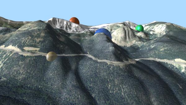
(Click for higher res version)
So you can see some different locations, color and transparencies. A bit ho hum...
Then I thought it might be nice to form a line in "string of pearls" fashion: Continue reading "Our Versatile Friend, the Sphere" »

(Click for higher res version)
So you can see some different locations, color and transparencies. A bit ho hum...
Then I thought it might be nice to form a line in "string of pearls" fashion: Continue reading "Our Versatile Friend, the Sphere" »
Thursday, October 18. 2012
Atmospheric "Moods"
I've posted previously on using lighting and attenuation to simulate weather conditions in landscape rendering. This post expands on that topic.
By varying atmospheric conditions, we can convey different "moods" in the resulting images. Here's a side-by-side example:

(Click each image for a higher res version.)
The left image - Crested Butte Sunrise - utilizes low (in the sky) red-hued lighting out of the East (viewer's right) and a dark blue sky. The diffuse reflection component is set high, while ambient (background) light is low. Attenuation is non-existent. It gives me the feel of being out at dawn on a crystal clear summer morning.
The right image - Whiteout! - takes a slightly different viewing perspective with much different atmospherics. Extreme attenuation causes very limited visibility. Ambient light dominates. Saturation of the color bands is near zero. This one reminds me of some "white knuckle" winter driving days in the mountains!
Wednesday, October 17. 2012
Silverton Skyline
Peakfinders show near ground views of an area's mountain backdrop with prominent landforms labeled. Peakfinders help residents and visitors learn about their geography and have been one of our most popular and requested products from customers. These can be generated from photographs, artist renditions or - in our case - computer renderings.
In the late 1980s, CTM produced our first peakfinder, which combined computer & artistic rendering - View to the West. Since that time, we've created peakfinders for outdoor kiosks (see, for example, this link) and a number of open space and trails maps (see, for example, the Missoula map.)
Here's one that I created of the skyline from the Silverton, Colorado, area:
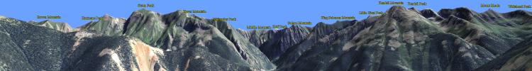
(Click image for higher res version.)
This was a partially successful attempt at automating the entire process. The computer rendering was created with edWare 3d. Summit text labels within the image area were taken from the USGS GNIS (Geographic Names Information System) dataset and projected into the image space, then automatically placed over the Silverton image using HTML5 and javascript. This second pass provides an opportunity to style text and other features utilizing the full HTML5 / CSS3 suite, rather than entirely through edWare 3d software. Shortcomings in styling are entirely my fault, not HTML5 /CSS3!
Tuesday, October 16. 2012
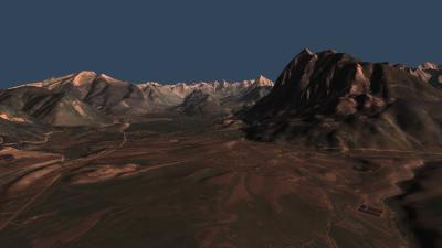
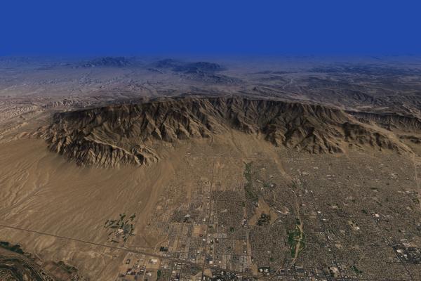
Sandias
The Sandia Mountains tower over Albuquerque - New Mexico's largest city. The range offers outstanding rock climbing, hiking and the memorable Sandia Crest National Scenic Byway. Although it's been many years since I've visited the crest, the view over Albuquerque remains etched in my mind.
This rendering is part of a virtual edWare tour of rugged landscapes of America's west:
(Click image for high res version - ~16 Mb)
Stark orange-hued lighting illuminates the range and the City in the foreground. It gives way in the distance to a deep blue attenuation designed to help highlight the Ortiz and San Pedro Mountains, and other landforms to the east. I really like the way this lighting / attenuation combination highlights the ridge crest, which otherwise could easily be lost in the background terrain.
The 1m resolution NAIP imagery provides nice detail of Albuquerque's urban landscape.
This rendering is part of a virtual edWare tour of rugged landscapes of America's west:

(Click image for high res version - ~16 Mb)
Stark orange-hued lighting illuminates the range and the City in the foreground. It gives way in the distance to a deep blue attenuation designed to help highlight the Ortiz and San Pedro Mountains, and other landforms to the east. I really like the way this lighting / attenuation combination highlights the ridge crest, which otherwise could easily be lost in the background terrain.
The 1m resolution NAIP imagery provides nice detail of Albuquerque's urban landscape.
Monday, October 15. 2012
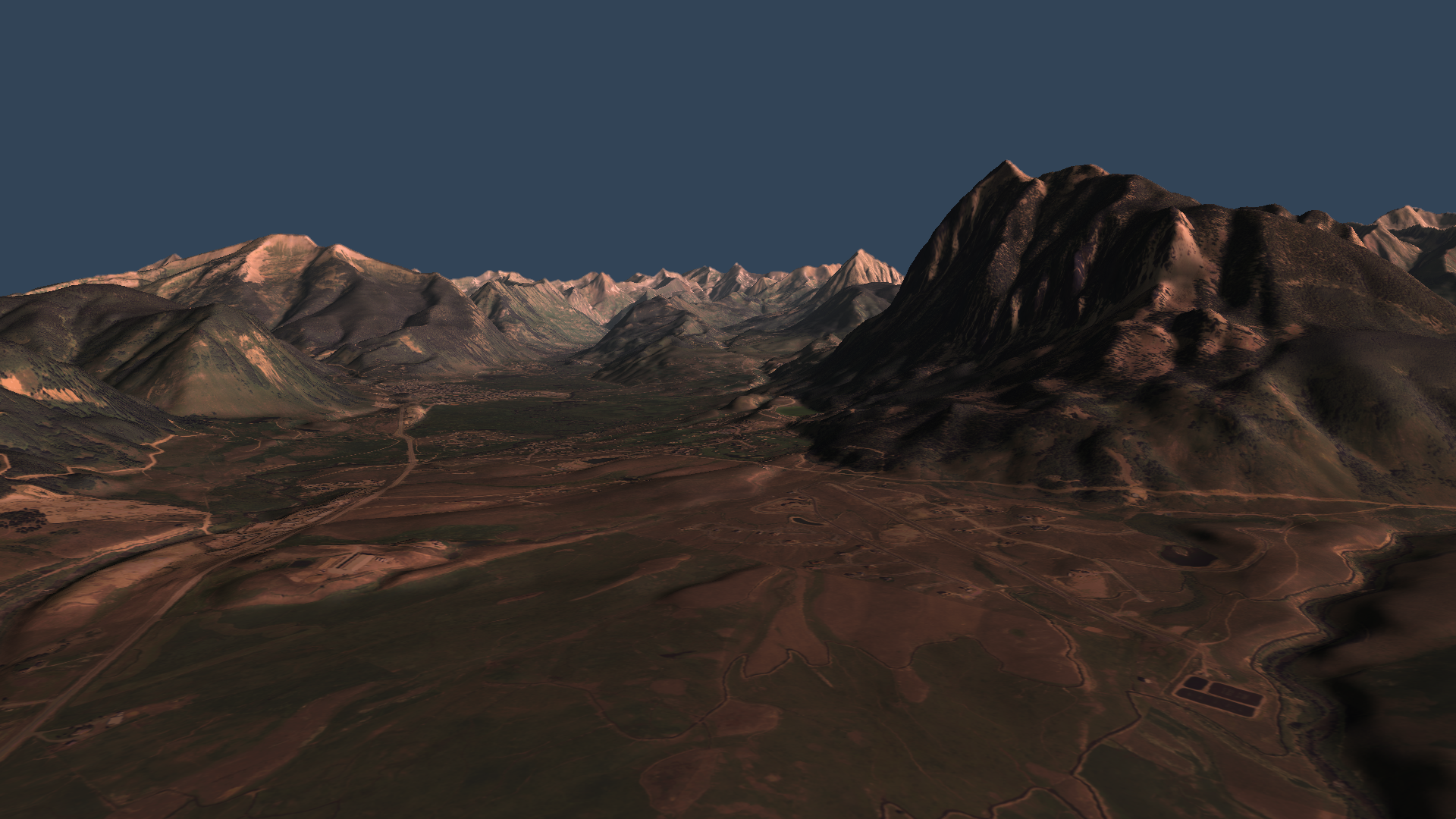
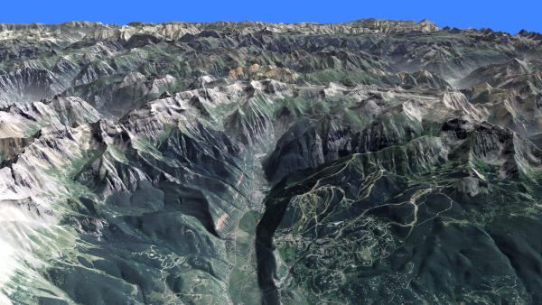
Telluride
When it comes to rugged mountain beauty, few places in America can compare with Telluride, Colorado. It's located along the All-American San Juan Skyway (see, for example, this link.)
Here's my shot at a computer rendering showing the Town and the surrounding San Juan Mountains.
(Click the image for the high res version: ~21 Mb)
This image has a great rendition of the "valley haze" effect, described here and here. Telluride sits in the foreground valley. The Telluride Ski Area lies on the mountainside to the S (right on the image.) Mountain Village is the development on the hillside in the immediate foreground.
Here's hoping for a great ski season this winter!
Here's my shot at a computer rendering showing the Town and the surrounding San Juan Mountains.

(Click the image for the high res version: ~21 Mb)
This image has a great rendition of the "valley haze" effect, described here and here. Telluride sits in the foreground valley. The Telluride Ski Area lies on the mountainside to the S (right on the image.) Mountain Village is the development on the hillside in the immediate foreground.
Here's hoping for a great ski season this winter!
Tuesday, September 18. 2012
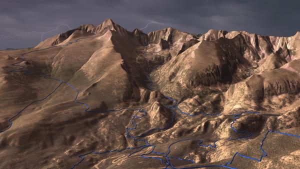
Glacier Gorge Trails
Here's a fun image map of the Glacier Gorge area in Rocky Mountain National Park (Glacier Gorge is the steep valley in the center of the image):
(Click image to get to image map site.)
Once on the image map site, mouseover a trail (you'll have to click (tap) on a mobile device) to get the trail name.
The background image was created with edWare 3d software, draping 1m res NAIP imagery over 10m res USGS DEMs. I used an ominous lightning-filled sky to add drama to the scene. The trails were extruded in the "tube" motif (there's a brief explanation here.)
For the trails, I downloaded a shape file from the Park Service site and projected the trails into "pixel space." Once in pixel units, I created vector buffers around the projected trails and defined area polygons in the image map. A javascript function invokes a server-side script to read the record from the DB and produce the text.
Longs Peak (14,256) is the major landform that bounds Glacier Gorge on the SE. This entire area is a specular destination for climbing - both summer and winter.
Tuesday, August 7. 2012
Buena Vista and the Collegiate Range
One of Colorado's outstanding views is coming down from Trout Creek Pass looking over the Collegiate portion of the Sawatch Range. The well-named town of Buena Vista sits below in the Arkansas River Valley. Here's an EdWare rendering of the region, taking a birds-eye view:
Click the image for the high res version.
This view shows five of Colorado's fourteeners. Mt Yale (14,196) is the prominent peak just left of the image center (the white spot along its flank in the foreground is a cloud "draped" over the terrain). Mt Columbia (14,073) and Mt Harvard (14,420) are the prominent peaks just right of image center. Mt Belford (14,197) lies slightly in the background to the right of Harvard and Mt. Oxford (14,153) is to the right of it. Despite their lofty elevations, all these peaks are easy hikes, but well worth the visit.
The recently designated Collegiate Peaks Byway follows Highway 285 along the Arkansas River Valley.